HK Collections Bag Advertisements
HEX = #EFB1BE
HEX = #8DC642
HEX = #FFFFFF
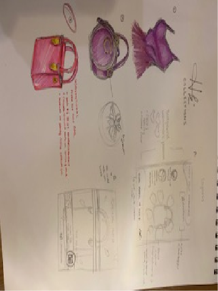
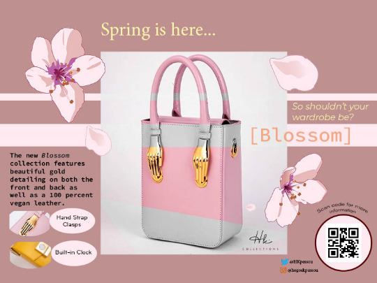
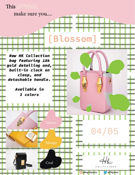
My client was the independent clothing and accessories brand HK Collections. One aspect of the client’s brand that drew me into the project was the fact that it was a black and woman-owned business.
The story behind the retailer was one of creativity, perseverance, and ingenuity, and I absolutely wanted to opportunity to market one of their products, that I personally wanted to purchase myself.
HK collections new “Blossom” collection featured built-in clock bags decorated with hand clasps. The target audience was mainly younger women with an international appeal, so I wanted to create advertisements that were both informative, yet playful.
Because the collection was to be released in the spring, I researched various swatches and decided on a light pink and green color palette paired with cooler neutral tones. Utilizing my illustrative background, I also created floral patterns and graphics that further encompassed the idea of “blossoming” into a new season.
Once the deliverables were successfully completed, I made sure to color correct and resize each advertisement via Photoshop so that they would appear properly in both physical and digital format.
Veja Sneaker Ad
HEX = #D62C75
HEX = #069152
HEX = #B7C833
HEX = #AA4E8C
.png)
.png)
This was a practice project in my last year of university that incorporated and intertwined Photoshop, Illustrator, and InDesign elements.
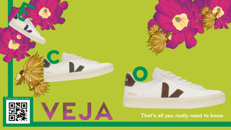
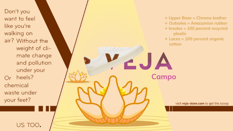
I was prompted by my professor to find a sustainable brand and use its brand identity and/or visual manual to create a promotional advertisement for an upcoming product. After tons of market research, I decided to go with the brand VEJA, a sustainable shoe company that prides itself in vegan and natural materials. The fact that the company is very transparent in regard to its employment and factory practices as well as yearly plans gave it good marketability as both millennial and gen z consumers are more likely to buy from brands with integrity.
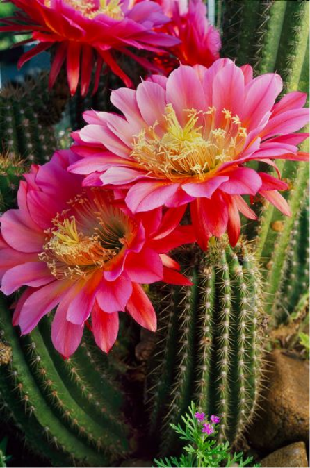
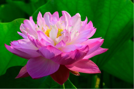
After looking at their various shoe designs and the formatting of their website, I had a good idea of what graphic elements I wanted to incorporate into the advertisement. I I decided I wanted to go with their “Volley Leather White Natural Shoe” and advertise its proximity to nature. Because I live in Los Angeles, I decided to research plants that were native to Southern California to invoke a sense of familiarity in the consumer market, but still ride on the environmental association. Hence, I chose the cactus flower and created illustrations in Illustrator to sparse throughout the advertisement. Afterward, I used Photoshop to crop and color and light correct the sneaker.
I finalized my advertisement with a QR code that would potentially lead to the company’s site.
Compartes Chocolate Ad
HEX = #EC008C
HEX = #D2616B
HEX = #F9BE82
This was another practice project during my junior year where I first attempted a multi-software project.
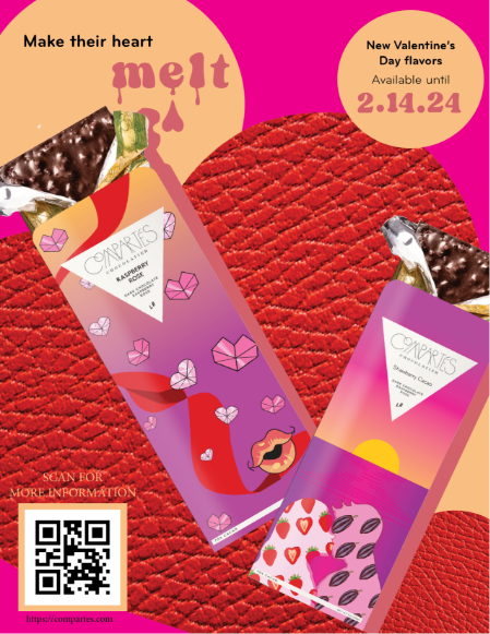
I chose Compartes chocolates for this project as their chocolate bar designs are often visually appealing as well as illustrative, something I like to replicate in my own work.
Keeping the color palette consistent with Valentine’s Day and the berry ingredients, I opted for saturated pink and red swatches as well as a paler orange as a neutral to create my background. To add texture to the ad, I used a leather texture that I had found on a jacket and re-colored it on Photoshop. Then I went into Illustrator to cut-out the texture and form it into a heart shape.
For the products themselves, I went into Photoshop after finding a png file of a chocolate bar and erased the original package design. After acquiring the measurements, I went into Illustrator and made several graphics from my sketches to create the final designs.
Once all graphic elements were present in the final product, I was ready to submit my project for final review. According to my professor, my color palette consistency was well executed and the blend of textures made the advertisement interesting to look at. Although she had critiqued the negative space could’ve been more utilized, the overall execution was a success.

.png)
