Federal Coffee Banana Cream Top Font


HEX = #F2BAD6
HEX = #783D46
HEX = #00A331

Federal Coffee is a coffee shop in West Los Angeles that serves common coffee favorites such as vanilla lattes, espressos, and Americanos. However, what sets it apart from other commonplace coffee shops is its signature iced pink latte; a both trendy and instagramable beverage that only costs fifty cents more than a regular latte.
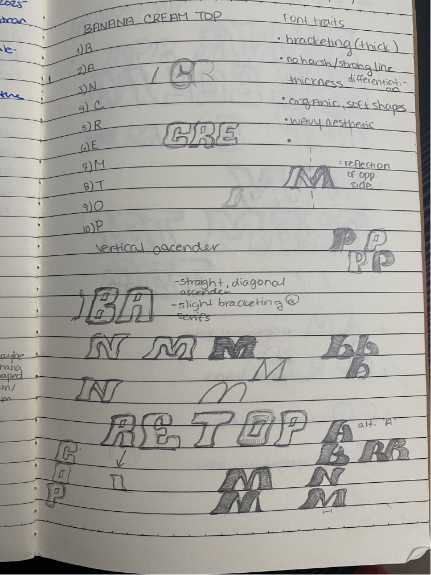
As a frequent patron and friend of the store manager, I saw that they were looking to push out a new seasonal flavor which they dubbed “Banana Cream Top.” I told the manager that I could assist them with any promotional materials they needed, so they commissioned me to create the typography. This new feature was a banana flavored cream topping sprinkled with cinnamon that could be added to a matcha or coffee beverage. So I drew a few thumbnails and did some research on both the brand and varying concepts regarding “banana” and “matcha.”
The result was a very soft, yet playful font with smooth brackets and serifs that resembled a banana peel. For the N’s, I decided to add some matcha texture and coloring for more visual interest. The client loved it, and they moved forward with using it in their marketing as seen on their social media page.
J.Johnny Southern Transport Logo (unused)

HEX = #FFE126
HEX = #ED1C24
HEX = #BCBEC0

J.Johnny Southern Transport is a transportation company based in Lafayette Louisiana
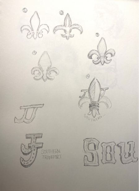
The owner came to me with the need for a logo and wanted to incorporate his Louisiana roots in the visuals. After several sketches and market research, I came-up with a pictographic logo featuring a truck and a flour di lis emblem on the base. Because of my familiarity with Louisiana and it’s culture, I also hypothesized that a brighter and more saturated color palette would be more attractive. New Orleans in particular does not shy away from brighter hues, and many famous artists draw from the city’s use of Mardi Gras colors (purple, green, and yellow). As for the typography portion, I wanted it to still pay homage to a southern aesthetic. As a result, I chose a typeface called Bandero while beveling and expanding it’s base in a radial fashion. The final result was a striking truck logo that draws the audience in with its dual composition. The final deliverable has been used by the client since 2022.
AZN Connection Logo

.png)
.png)
HEX = #FFE126
HEX = #FFBD20
HEX = #BE0000
HEX = #3C2415

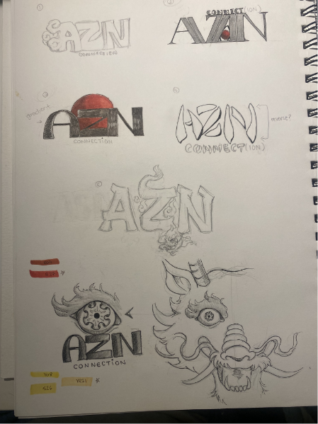
AZN connection is a podcast group highlighting the everyday challenges, perspectives, and experiences of Southeast Asians internationally with particular focus in Canada. One of the co-founders, Jeffery Tram, reached out to me for an updated logo that would portray the podcasts vision and content. I did research pertaining to design trends and color palettes that correlated to Southeast Asian culture, and created several sketches of possible idea. I wanted the design to truly capture the culture without it looking too stereotypical. After relaying the sketches to Jeffrey, we agreed upon a more dynamic logo with a dragon incorporated somewhere into the design.
Golden yellow and crimson red were key features in the logo as these colors are generally recognizable as an Asian color palette. For a more fun and eye-catching design, I slanted the top letters to create the idea of movement and paired them with a more minimalist font at the bottom (both of which I hand-crafted). Installing the dragon was the most challenging aspect of this logo, as it had to meld into the letters without such stark contrast. To achieve this, I made the dragon’s body and ‘Z’ the same swatch color, but gradually increased the opacity of the scale outlines as they approached each other.
After showing the final result to Jeffrey, the logo became a staple for their brand and is currently being used on their social media platforms.

.png)
