.png)
.png)

HEX = #FFE126
HEX = #0D1139
HEX = #B57731


HoneyMee is an ice cream company based in Los Angeles California, and prides itself in producing “California True Milk” ice cream, certifying it as both a local and organic brand. It’s often picturesque form of branding with social media worthy photography and consistent display of fresh meadows, bees, and honeycombs made it a very attractive brand that I wanted to work with.
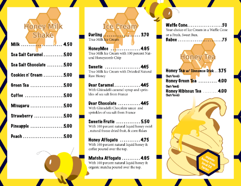
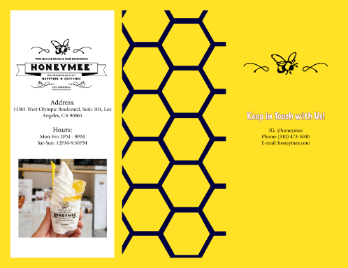
As a part of my final portfolio for my design program at UMGC, I had to create print materials for a local brand of my choosing. So I opted to create a trifold brochure for HoneyMee. Observing that the brand had a particular emphasis on honeycombs (also a key feature in their food products) and bees, I designed a honeycomb pattern and layered this pattern within and on the back of the brochure. When selecting the color palette, I went with a bright yellow and darker blue for playful contrast. I wanted to make sure there was a darker tone within the design, as most of the brochure would be utilizing bright or softer colors.
After the background elements were finished, I began working on the foreground and sketched out a honeybee and ice cream illustration to use as playful elements within the menu. The honeybee really added depth to the design as it was arranged to be the most foreground graphic element.
Once all of the illustrative components were finished, I took menu items from the store and used Adobe InDesign to properly format each page with a standard tab and leading increment between items and pricing for page consistency. After setting a proper bleed and slug, I printed both the front and back of the brochure and pasted both sides together to create a mock-up.

.png)
